ENPOWERED
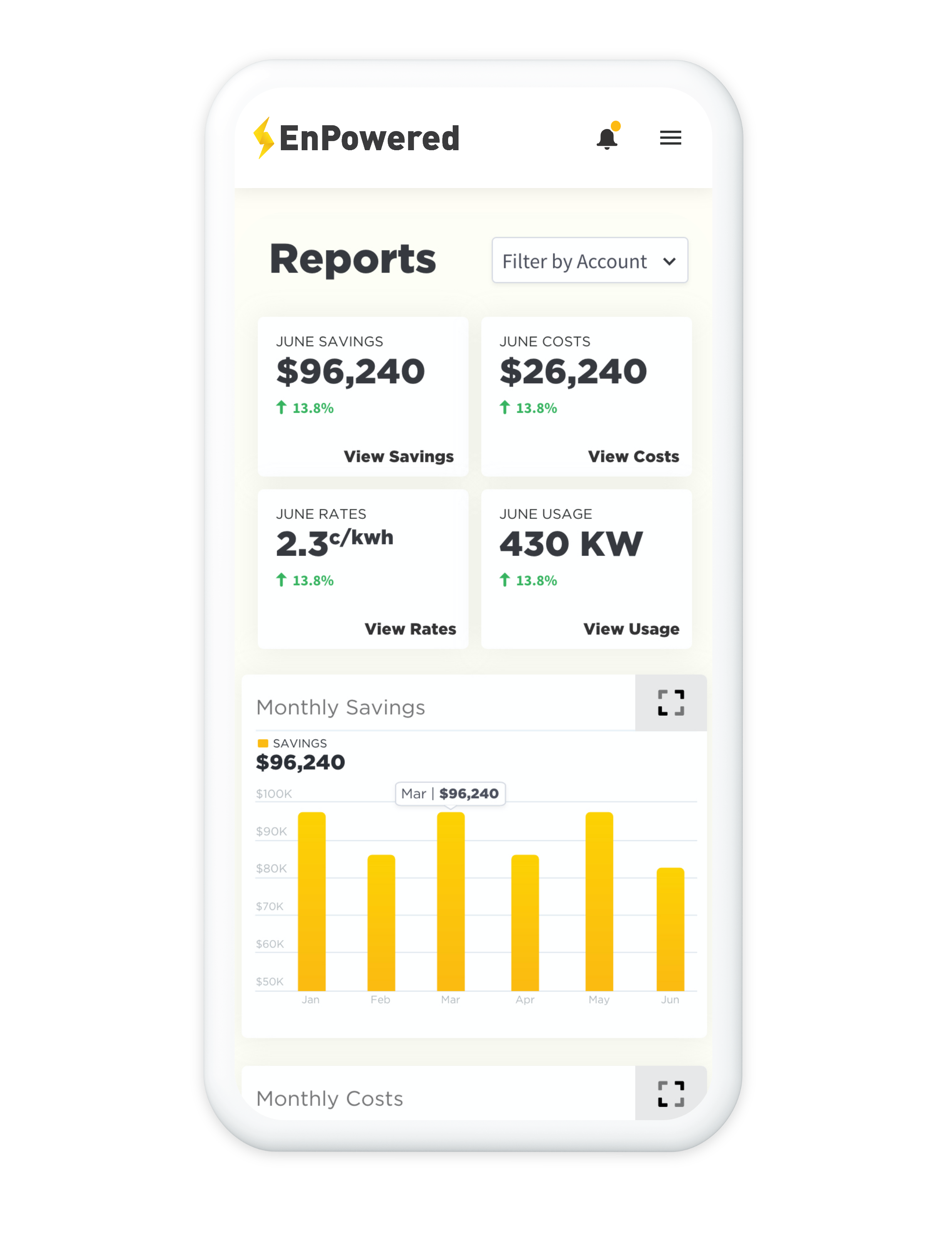
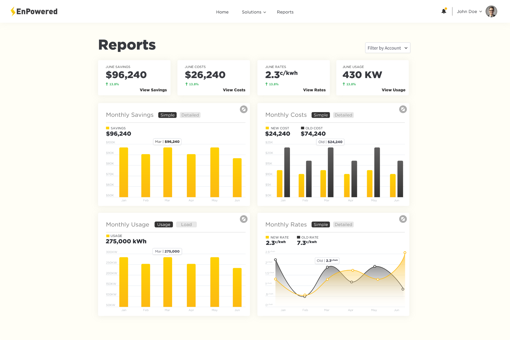
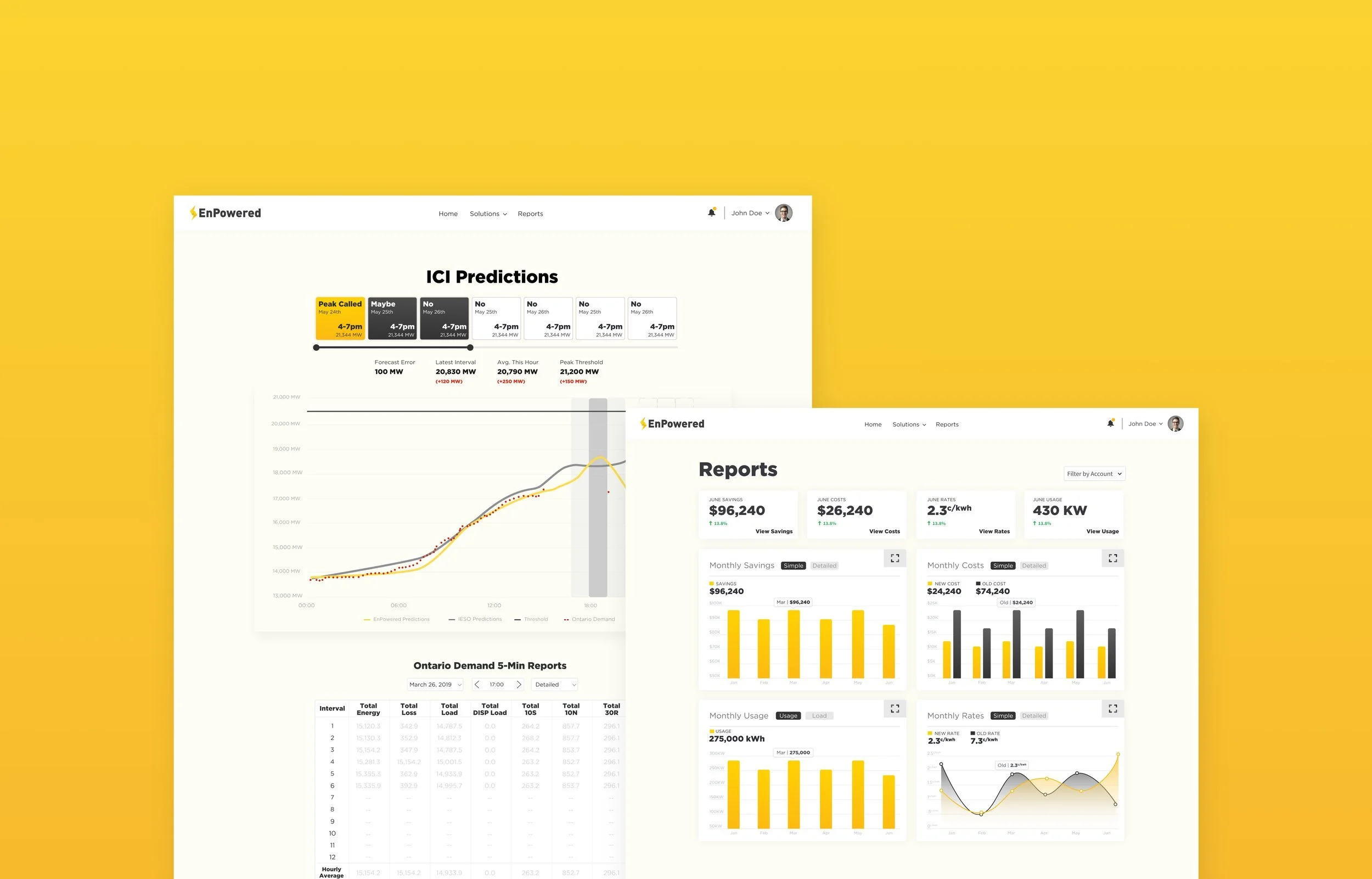
EnPowered offered customers a web platform where they could manage their electricity usage, see our realtime and forecasted energy predictions, as well as see their meter readings Costs, Savings, Rates, and Usage.

Discovery and Analysis
To initiate the discovery phase, I engaged in productive discussions with stakeholders and key customers, aiming to gain a comprehensive understanding of their existing workflow. This involved setting clear project goals, defining the project roadmap, and collaboratively sketching high-level concepts on a whiteboard. Furthermore, I conducted interviews with diverse customer user types across different organizations, carefully listening to their challenges and aspirations.
With the gathered insights, I embarked on synthesizing common themes to distill key patterns and trends. This led to the creation of persona profiles, capturing the unique tasks and goals of each user group. To gain a deeper understanding of the interactions between different user types within the platform, I developed journey maps. These visual representations aided in mapping out relationships and informing the development of low-fidelity business flows, refining the screen-to-screen interactions in the process.


User Interviews & Test Sessions
Once the initial mobile designs were finalized, we conducted further testing by engaging users in meaningful conversations. These discussions aimed not only to identify any missing elements in the mobile designs but also sparked valuable insights into users' perspectives on scaling the experience to desktop devices.
In the context of mobile, our goal was to provide users with the necessary information to make informed decisions efficiently. However, when it came to desktop, the focus shifted towards creating a user-friendly interface that allowed them to view a greater amount of information at once, facilitating a more comprehensive understanding of the data.
By incorporating user feedback and considering their needs across different devices, we ensured a seamless and tailored experience for our users, optimizing both mobile and desktop interfaces to cater to their specific requirements.


Mobile First Design
Through in-depth discussions and user testing sessions with our key customers, a significant insight emerged: the majority of our users primarily accessed our portal via mobile devices. While this finding initially caught us by surprise, it was a crucial discovery that prevented us from investing valuable time and resources in developing a desktop-centric solution.
Interestingly, although most users accessed the portal on their desktops during work hours, it was during critical moments, such as when we needed to send Peak Alerts notifications, that they were either on the factory floor or had already left for the day. We even received feedback from a user who mentioned using our portal extensively during post-work bike rides, emphasizing the need for an optimized mobile experience. Armed with this valuable user input, our development process adopted a mobile-first perspective, ensuring that our solution catered effectively to the preferences and needs of our users, regardless of their location or activity.